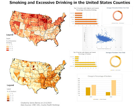
For my map I chose to have simple but unique color palettes for each variable so they could be distinguished from each other. Additionally I chose to make the corresponding infographics and charts the same color to avoid confusion and enhance the understanding. I used simple charts the both shared similar designs so that they were understood they were showing similar data but the data was labeled clearly so that it was clear what the information was. In general I used the five principles of map making such as visual contrast, and balance so that the map is easy to understand. Though in hindsight the scatterplot could have been better in terms of color design and title as it appears to stick out.


.png)
.png)
No comments:
Post a Comment