As you can see from the first map proportional images can be quite useful for mapping information that can be negative and positive. For this map we created two layers in order to show a negative growth and a positive one with appropriate symbology for both and legend that accurately shows the size of differences. For the second map we used a bivariate
choropleth mapping method to show the relationship between two variables. In order to do this correctly the data had to be normalized and had to be reorganized in a way to create a new symbol for the new relationship data. This also involved creating a 3X3 color chart based on the percentage of each variable the color had to be complementary and be able to blend well so that any patterns could be easily distinguished in the map.
Wednesday, February 22, 2023
Monday, February 13, 2023
Analytics Lab 5
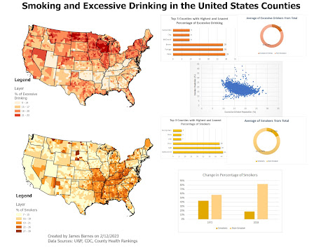
For my map I chose to have simple but unique color palettes for each variable so they could be distinguished from each other. Additionally I chose to make the corresponding infographics and charts the same color to avoid confusion and enhance the understanding. I used simple charts the both shared similar designs so that they were understood they were showing similar data but the data was labeled clearly so that it was clear what the information was. In general I used the five principles of map making such as visual contrast, and balance so that the map is easy to understand. Though in hindsight the scatterplot could have been better in terms of color design and title as it appears to stick out.
Wednesday, February 8, 2023
Color Choropleth Lab 4
For the first image you will see the color ramps that I created. You can see that the first two ramps are similar in the sense they seem to follow the same color hue but have a different shade. This is base on the RGB values having predictable changes throughout the ramp such as increasing the value by 20 each time. While the color brew is a computer generated color ramp that appears to have two colors of similar hues one for the light side and the other for the dark side. Each have a various amount of work to create with the first two having various calculations with some trial and error while the last have very little.
In the second image you can see the choropleth map I created from population change as well as the legend. I chose to have five classes to make the map simpler to understand with zero being the center of the legend and the two extremes as the ends. I chose colors that were associated with a negative and positive change like green and purple.
Wednesday, February 1, 2023
Terrain Visualization Lab 3
In this lab I worked with terrain of maps. Specifically with methods on how to use hillshade to show the topography and terrain features of the natural landscape. For my map that is shown above I chose to use a traditional hillshade features since it worked best with a transparent layer that shows landcover over the topography. Though the multidirectional was viable ai found that with a layer over it it wasn't as visually pleasing. So I managed to create a more visually appealing map with the other hillshade and using the essential map elements to create balance and a good hierarchical structure.
Subscribe to:
Comments (Atom)
LAB 6 Scale Effect and Spatial Data Aggregation
In regards to the effects of scale on vector data I learned that as the larger the scale the larger the units that are measured come out to ...

-
During this lab I worked with DEMs and TINs in ArcGIS Pro. I learned about the difference between DEM and TIN where I learned that TINs are ...
-
In this lab we worked with Isarithic Maps. More specifically we created a map that showed the annual precipitation and how it relates to el...
-
For this lab I worked on the ability to use GIS accurately assess coastal flooding through several methods of analysis. In general we used...


.png)

.png)