Tuesday, May 31, 2022

Module 2 Debug & Error Handling


In this lab I learned the basics of debugging code. The concepts we learned included how to recognize errors, how to use the python debugger tool, and how to use "try" and "except" in a script. I practiced these skills on three separate scripts, their outcomes and the general idea of the way these scripts work can be seen above in the images and flow charts. In order to determine if there were any errors in the script you can run it and the message box will either produce the intended result or an error. Or you can use the debugger tool to go line by line to identify if there is an error in each line. I chose to do both to hone my skills and determine if there were more errors beyond the ones I could identify and corrected them as they appeared. In addition I used try and except to skip over errors and name them.

Tuesday, May 24, 2022

Module 1 Python Fundamentals


In this lab I created four pythons scripts one to print my name from a list and another to generate a list of numbers from 0 to 10 that was twenty units long. Then I created additional scripts that altered two original scripts to change their output for example I used indexing to print only my last name from the list. For the other script I used a if else statement to create a new list that identifies and counts the predetermined unlucky number then used a while statement  to remove each occurrence and  print how many times it was removed.


Tuesday, May 3, 2022

Module7 Neo Cartography / 3D Mapping


In this lab we worked with on 3D modeling and cartography in Google Earth Pro in which we created a population density dot map with additional layers for counties and surface water in the state of Florida from data created in Arc Gis Pro and imported into Earth as a KMZ file. Then we learn how to navigate in tour mode through Earth and seeing various cities and their 3D buildings and recording the views.

Friday, April 29, 2022

Module 6 Isarithmic Mapping


 In this lab we worked with Isarithic Maps. More specifically we created a map that showed the annual precipitation and how it relates to elevation in the state of Washington. This was done using the PRISM model created by Oregon State University that is able to accurately create a grid out of the study area and use digital elevation models to fill in the each grid location to create map like the one I created above. In addition we use hypsometric tinting and continuous tone to show the elevation and its effects on the study area with contour lines clearly separating the zones.

Sunday, April 24, 2022

Module 5 Choropleth


For this lab I worked with Choropleth Maps which show the how data is distributed in certain areas. For this map we worked with Population Density and Wine Consumption in Europe. I created the map using concepts like proper symbolization and typography. In addition I used proper data classification to accurately display the data in a manner that shows the distribution appropriately. 

Saturday, April 16, 2022

Module 4 Data Classification


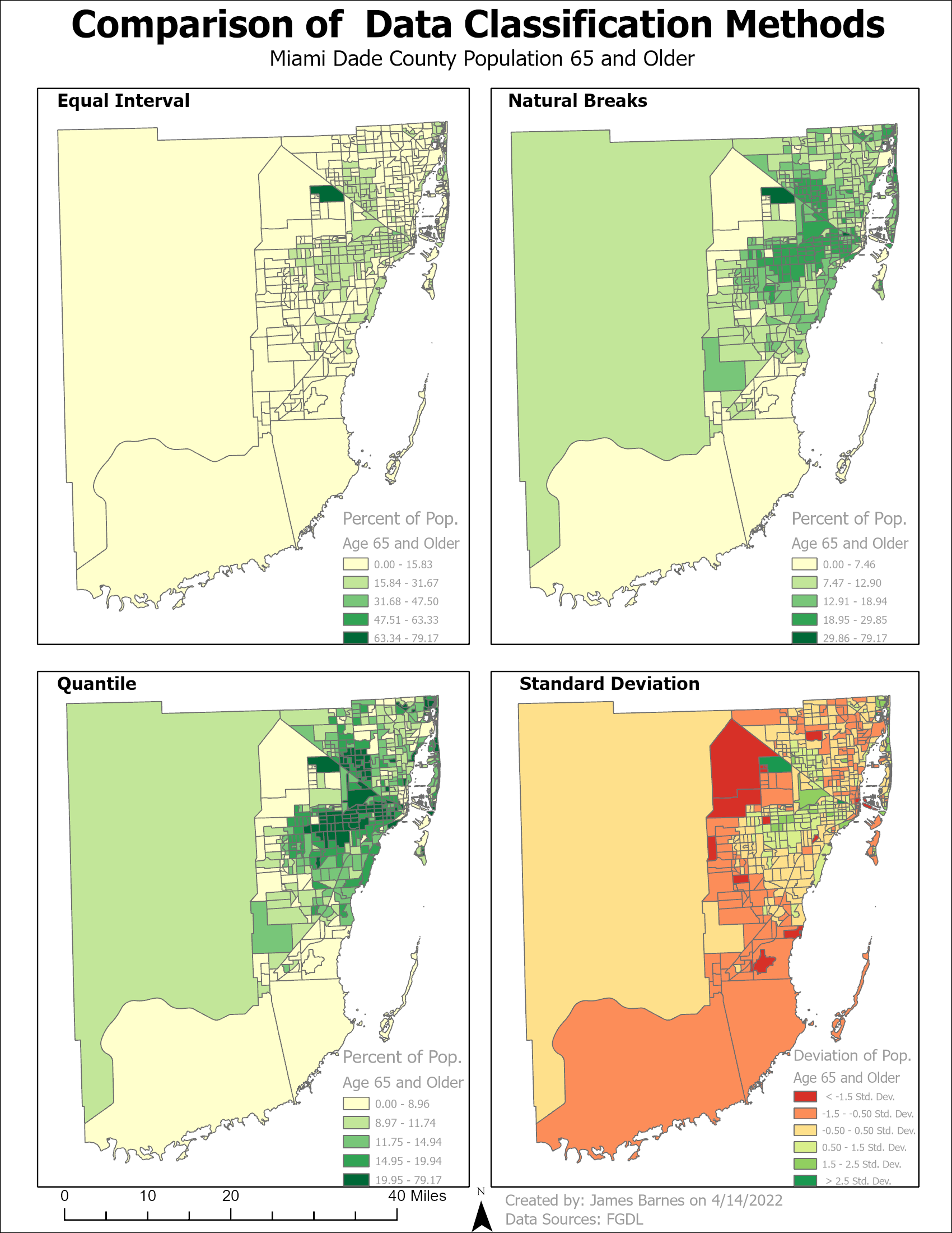
For this Module we worked on using different types of data classification specifically Equal Interval, Natural Breaks, Standard Deviation, and Quantile. We learned the pros and cons of each classification type and how they affect the data when displayed on the maps below. We created two maps based on the senior (age 65 and up) population of Miami Dade county one that showed the four classifications with just the percentage of the target demographic in each census tract and the other normalized by area to show the concertation of the targeted group in the county and how each classification affected it. 


Friday, April 8, 2022

Module 3 Cartographic Design

In this lab we were task to use some of the most basic but also the most important principles of Cartographic design. Some of these principles include balance, contrast, and visual hierarchy which all help to assist the reader to determine the purpose of the map and understand where it is. To begin the process of applying the principles I first had to add all the data that was needed then edit the size and color to show the visual hierarchy and contrast between the items and the background. This was all done in ArcGIS and the only challenging part of the assignment was trying to make sure all the details fit nicely and constantly editing the details to see how they looked. 


LAB 6 Scale Effect and Spatial Data Aggregation

In regards to the effects of scale on vector data I learned that as the larger the scale the larger the units that are measured come out to ...